Work Raaaak
Motion Branding
Why
Our own brand in motion
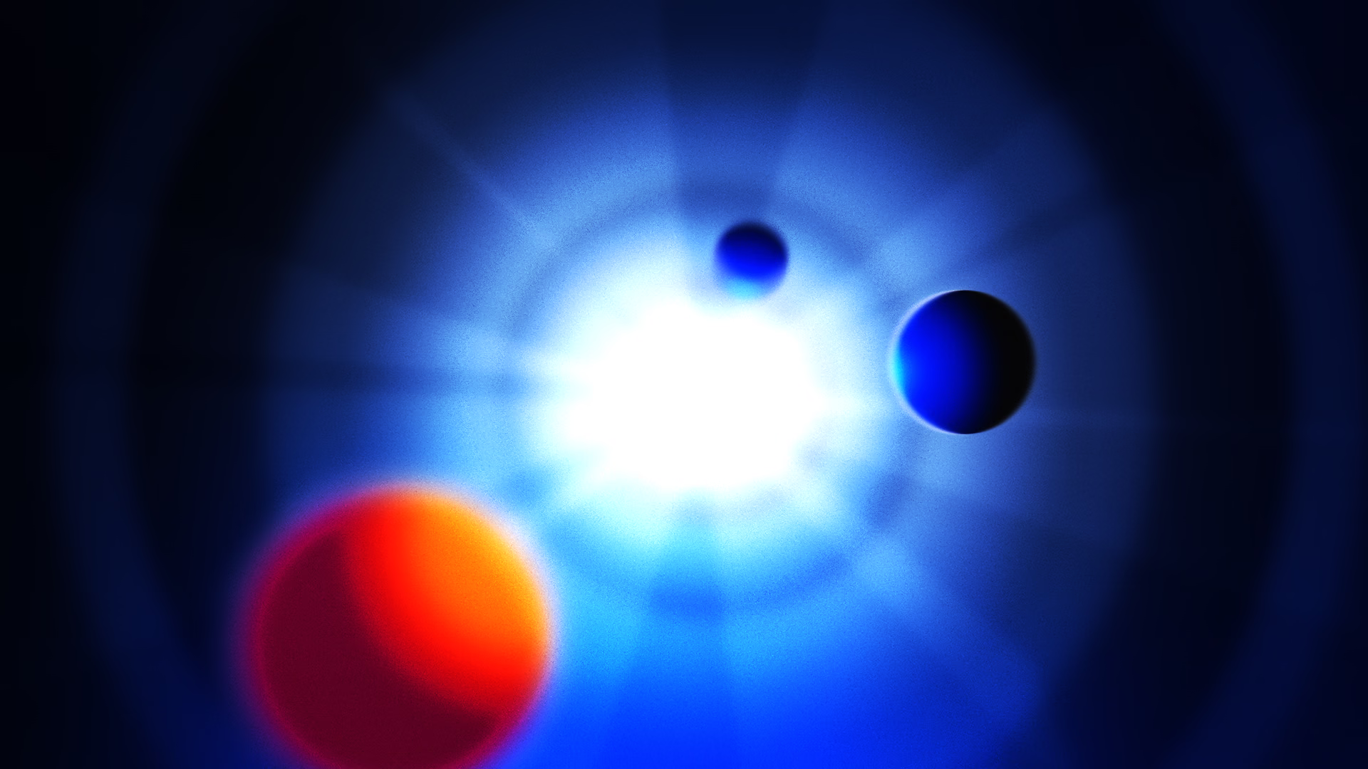
A visual identity doesn’t only live on paper. We translated our own visual identity into a dynamic showcase in which typography, colour and motion come together.
The result is a set of reusable animations, from video intros to the animations on this website.
What’s inside
Building blocks you can use again and again
Motion branding only works when it’s reusable. That’s why we didn’t design a one-off animation, but a system.
- Logo animation with the spinning star.
- Animated typography and transitions.
- Colour combinations from our palette: blue, pink, orange and mint.
- Web animations, such as the loader on this site.
- showcase
- 0:45
- brand colours in motion
- 4
Credits
- Client
- Raaaak (own brand)
- Concept, design & animation
- Raaaak